24stills
Giving a video studio a website worthy of its films.
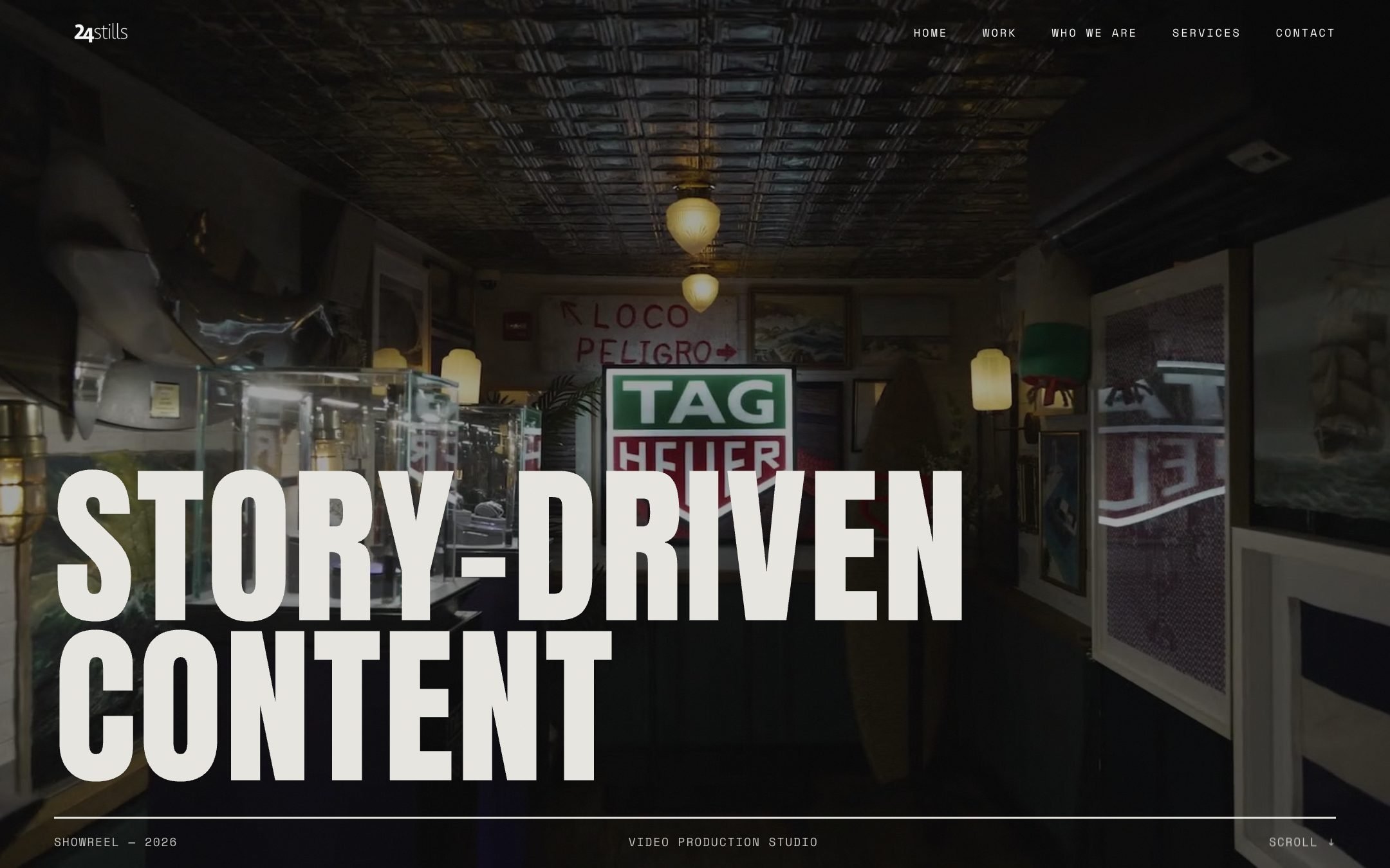
A website that finally shows 24stills for what it is: a story-driven video production studio.
- 24stills
- Video production studio · New York
- 2026
- Live
Challenge
The old site looked moody but said little. Services were missing, the films had no room, and there was no clear way to get in touch.
Approach
Make the films the hero, explain the services in plain words, and give every page a next step. Visually, borrow from film: bold type, one signal colour, edit-like pacing.
Solution
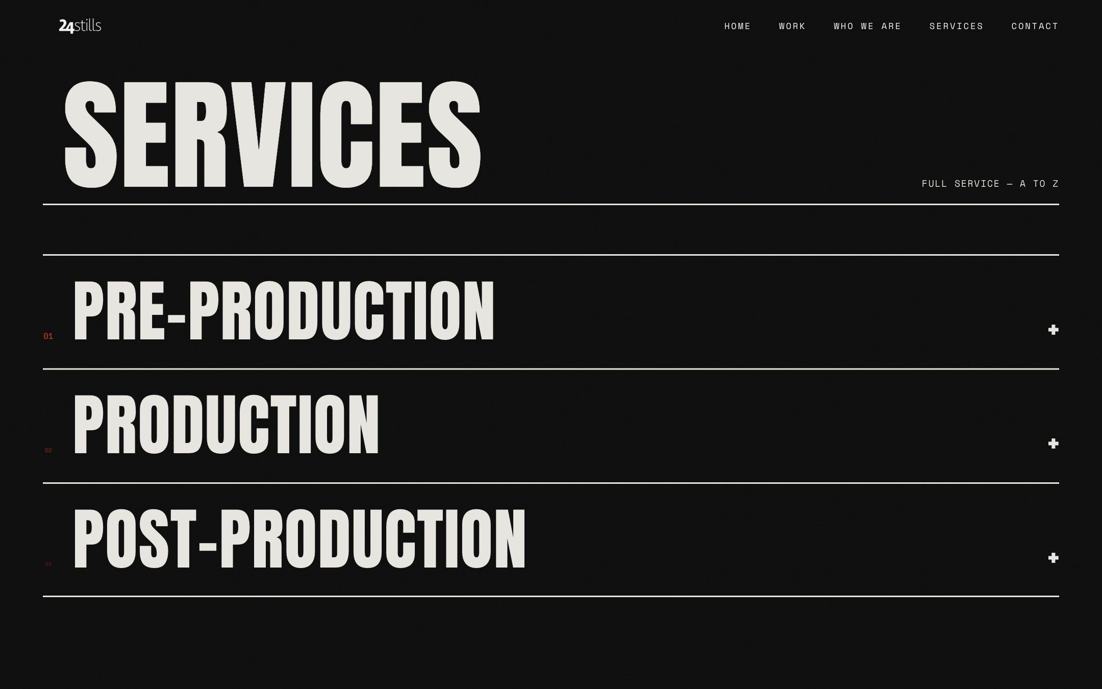
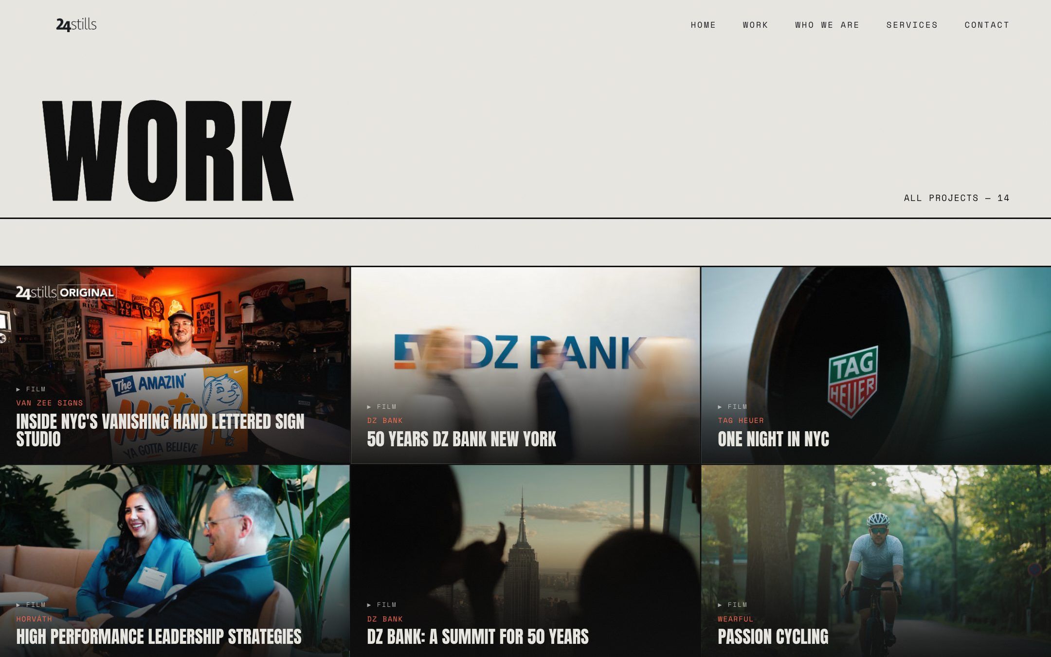
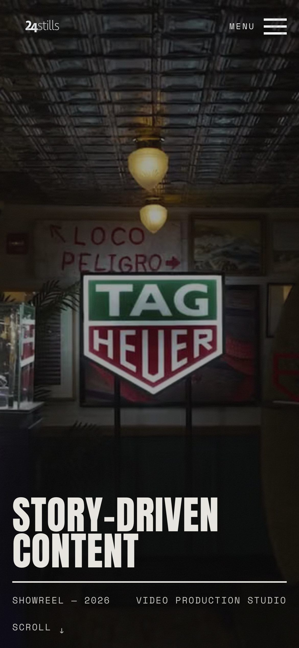
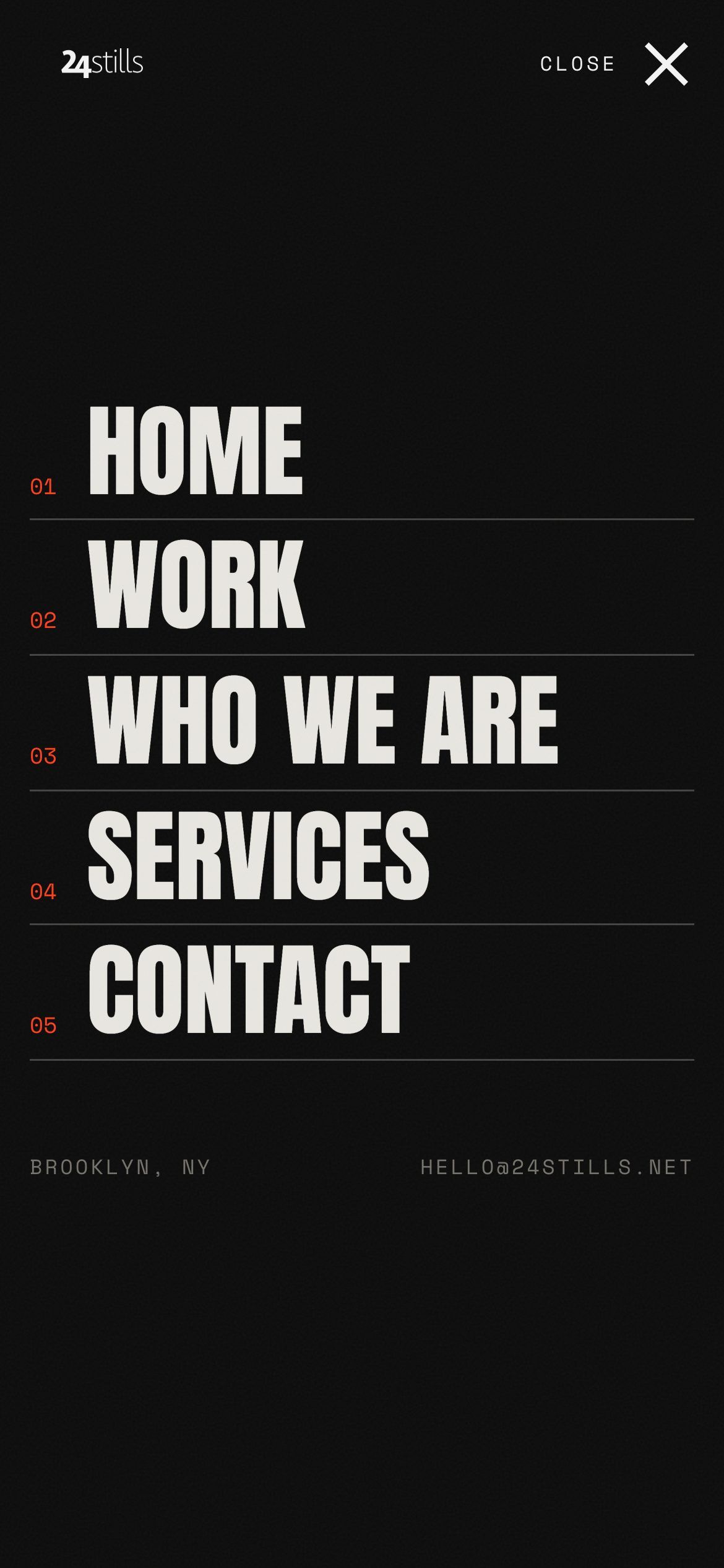
A showreel-led home page, a cinematic work index, services from pre- to post-production, and a full-screen mobile menu.
Positioning on the first screen
“Video production studio” is stated beside the showreel.
Work given real prominence
Films labelled by client and format, plus a full index.
Services explained A to Z
Three production stages, each with what’s included.
Clear routes to enquire
Contact points close every key page.
Before and after
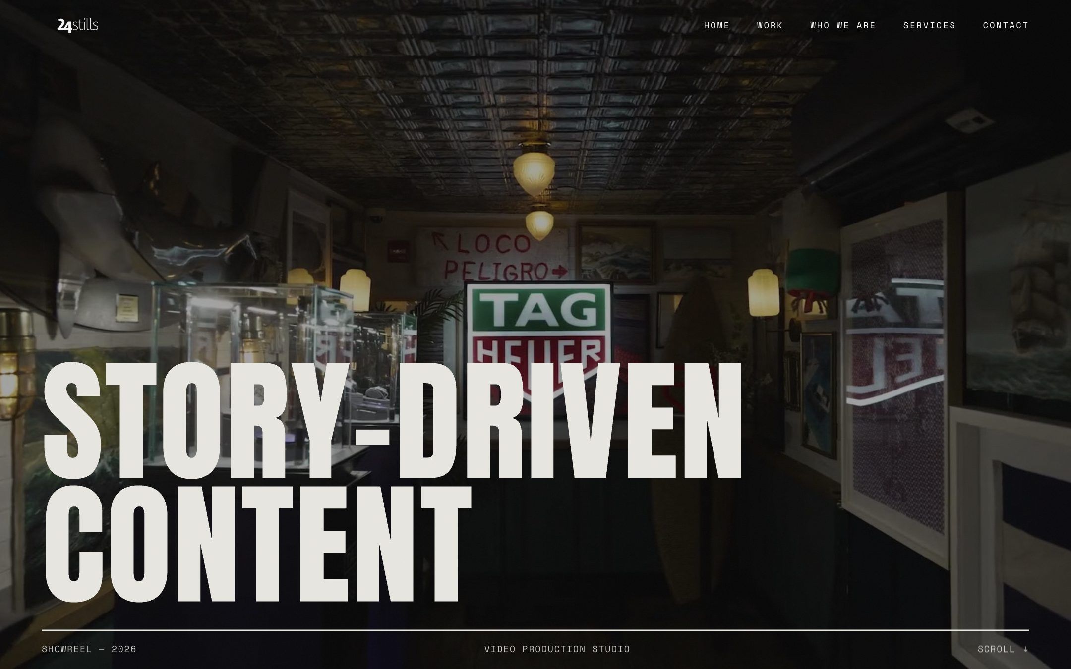
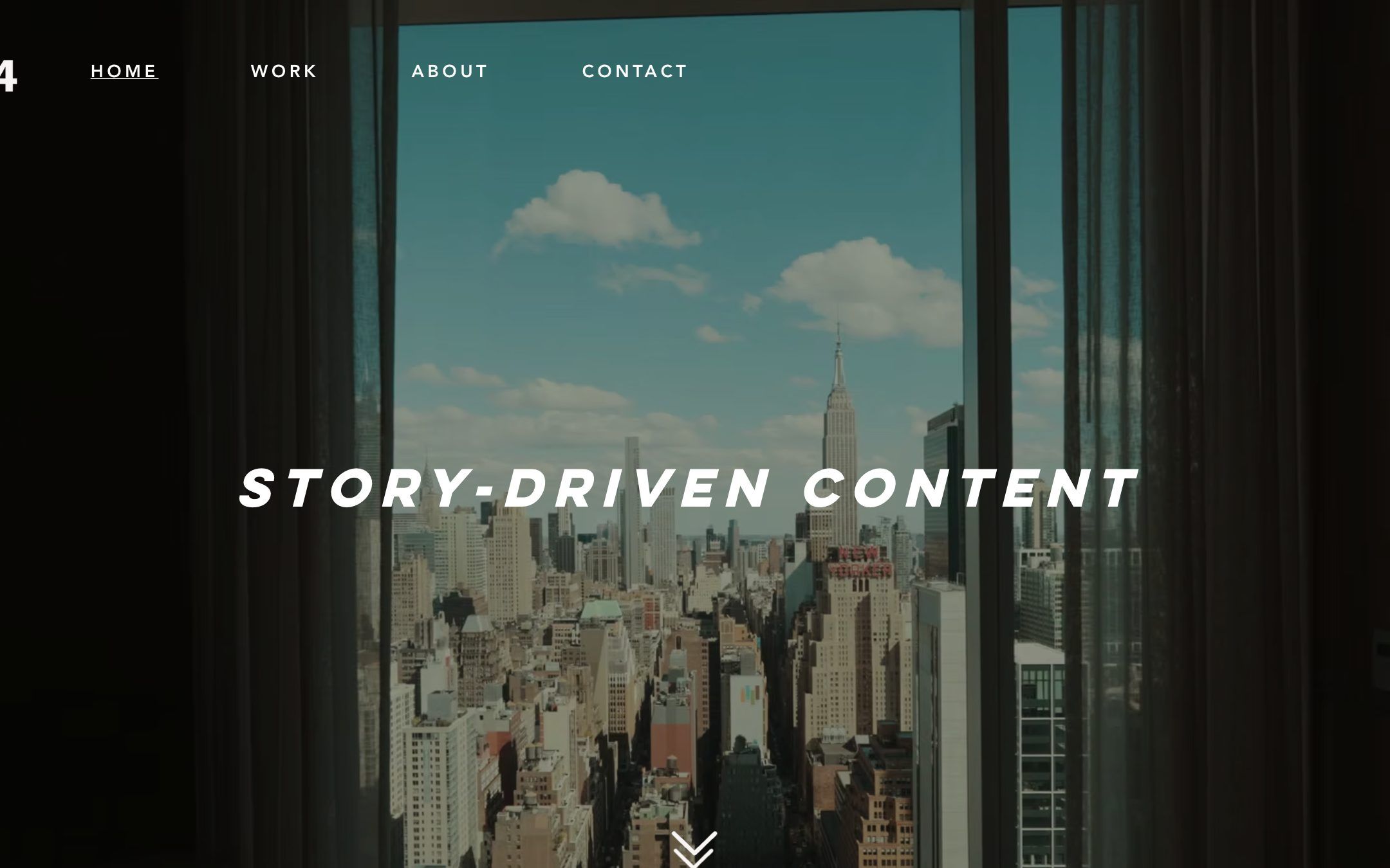
An opening like a film
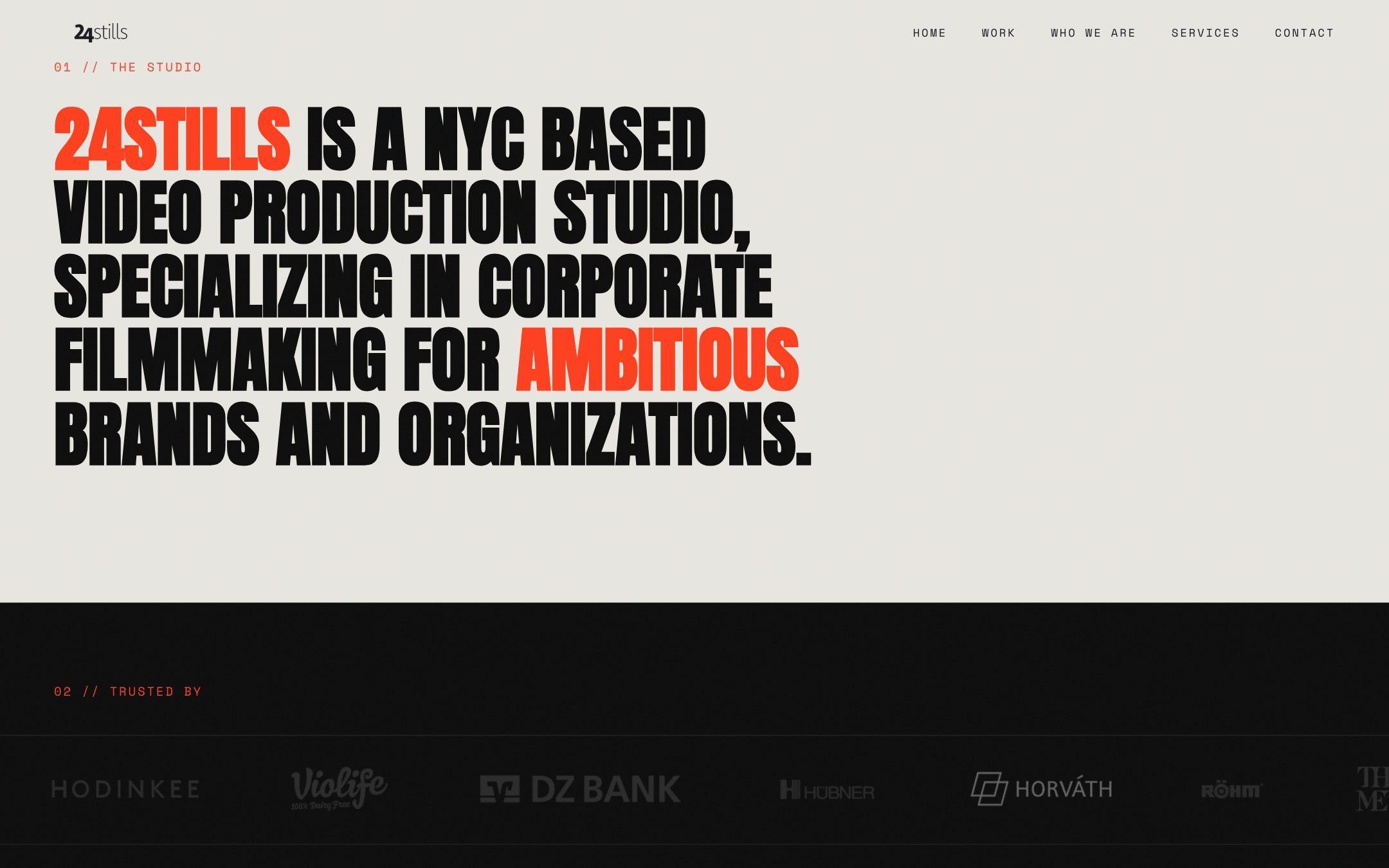
What it’s built to achieve
Clearer first impression
Visitors know what 24stills does within seconds.
More of the work seen
Films are front and centre, not buried.
Easier enquiries
A contact route on every key page.
No performance data has been shared, so no figures are claimed. These are design goals.
What we did
We contributed to the redesign and development. The films and footage are 24stills’ own work.
- Structure and content hierarchy
- UX and UI design
- Front-end development
- Interaction and motion
- Benjamin Mogel · Founder, 24stills
Next.js · Sanity · GSAP
